There is little benefit in having a great loyalty program that no one understands. No one will join. For this reason, a loyalty explainer page is absolutely important. Explainer pages should aim to do the following.
1. Excite customer interest in benefits
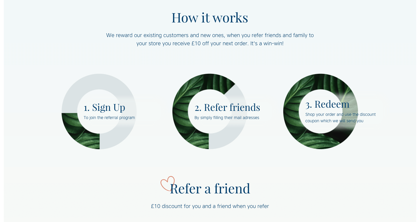
2. Explain how the program works
3. Encourage the customer to participate
DOs & DON'Ts
STEP 1: EXCITE CUSTOMER INTEREST
STEP 1: EXCITE CUSTOMER INTEREST
- Excite customer interests with taglines, a catchy loyalty program name, tier names, point names, etc that not only relate to the brand in a meaningful way but also portray the brand's deliverable value or UVP.
- Example. To reach this introductory section (pictured immediately below) of the loyalty program, visitors click the provocative 'Get $10' option on the top menu. Who won't be excited about the prospect of earning rewards passively while he/she sleeps? What a nice tagline. The program's name 'Sleep Squad' is also attractive as it suggests a promising mission that would ensure members restful nights.
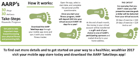
Other popular names include AARP's 'Take Steps' rewards program (that involves encouraging members to exercise), 'stars' for the points in Starbucks' rewards programs.
- Grab attention to advertise the program. For online marketing, advertise the program key benefits like 'Get free shipping', 'Get x exclusive benefits' and so on with eye catching buttons and banners on ALL pages. For brick and mortar marketing, use shelf talkers, wobbling shelf talkers, shelf talkers with tear off material (like for custom orders), window clings, point-of-purchase (POP) displays in high visibility spaces.
- Give a concise explanation how the program works.
- Example. 'Give x, get x!' is a popular and easily grasped concept used by several brands, either as the full extent or part of a loyalty program. It encourages brand awareness through envangelism. This approach also allows brand to use emotional marketing by appealing to social needs.
 |
| Drinkfinity explains the same 'give x, get x' as Klova above. |
After scrolling down from the 'give, get' section, the more common aspect of the program is explained.
- Organize program details as simply as possible. In the case of Klova above, the whole program is complex. The 'give x, get x' facet of has its own space. In fact, in the case of Drinkfinity, that 'give x, get x' facet can even be the whole program. Either way, it gets its own space while the other facet involving converting purchases for points as a currency also gets its separate space. This ensure customers can easily digest a lot of information.
- Use a minimalist approach; keep the page as uncluttered and simple as possible. For instance, icons can communicate with less text to allow customers to digest details more readily. Have as few distractions on the page as possible.
As shown in the 2 images immediately below; Starbucks' page scrolls from the summary of rewards into the rewards catalog (discussed in greater detail below).
- Give simple instructions. 'How-to' sections are available in all the best cases; 'how to earn'. 'how it works' that explain the process in a 1-2-3 fashion. Here is how Klova demonstrated 'how it (the program) works'. This section requires more reading and may be placed lower on a long scrolling page or deeper in a website.
Upon scrolling beyond the short rewards catalog, the ways of earning the 'stars', ie Starbucks' points is presented first with a summary page and then with 3 steps for signing up.
Starbucks also provides instructions for signing up with their app and people without smartphones.
Starbucks even has a FAQs page deep in the site for more technical setup issues.

AARP wonderfully explained their entire rewards program; including the program's name 'take steps', their tagline 'get paid to take steps towards increasing your physical fitness and preventing falls', 4 easy instructional steps and rewards method. The only downside is that the print is therefore small which is arguably not ideal for their target market of elderly people.
The AARP encourages members to exercise to increase physical fitness and prevent falls, which by the way, is something that might reduce the rate of claims covered by the association's insurance program. In other words, the beauty of this is that it is mutually beneficial to the member and AARP. Members get rewarded $1 per day that they complete exercises within each month. The cheque is posted to each member's home address.
- Make the presentation eye catching as seen in the contrasting colors of Klova's program.
- Provide additional details apart, like on a different webpage or leaflet for those customers who want the additional information. Example: Klova does not overwhelm readers immediately with the finer details (like how number of points to be awarded for Facebook likes versus Twitter retweets). When scrolling through the introductory level of the program, those details are accessible only if customers click on links that are less prominent than the summary, introductory details. Klova placed a 'Learn more' link that opens up a side panel with options for 'ways to earn' (shown below) and 'your rewards'.
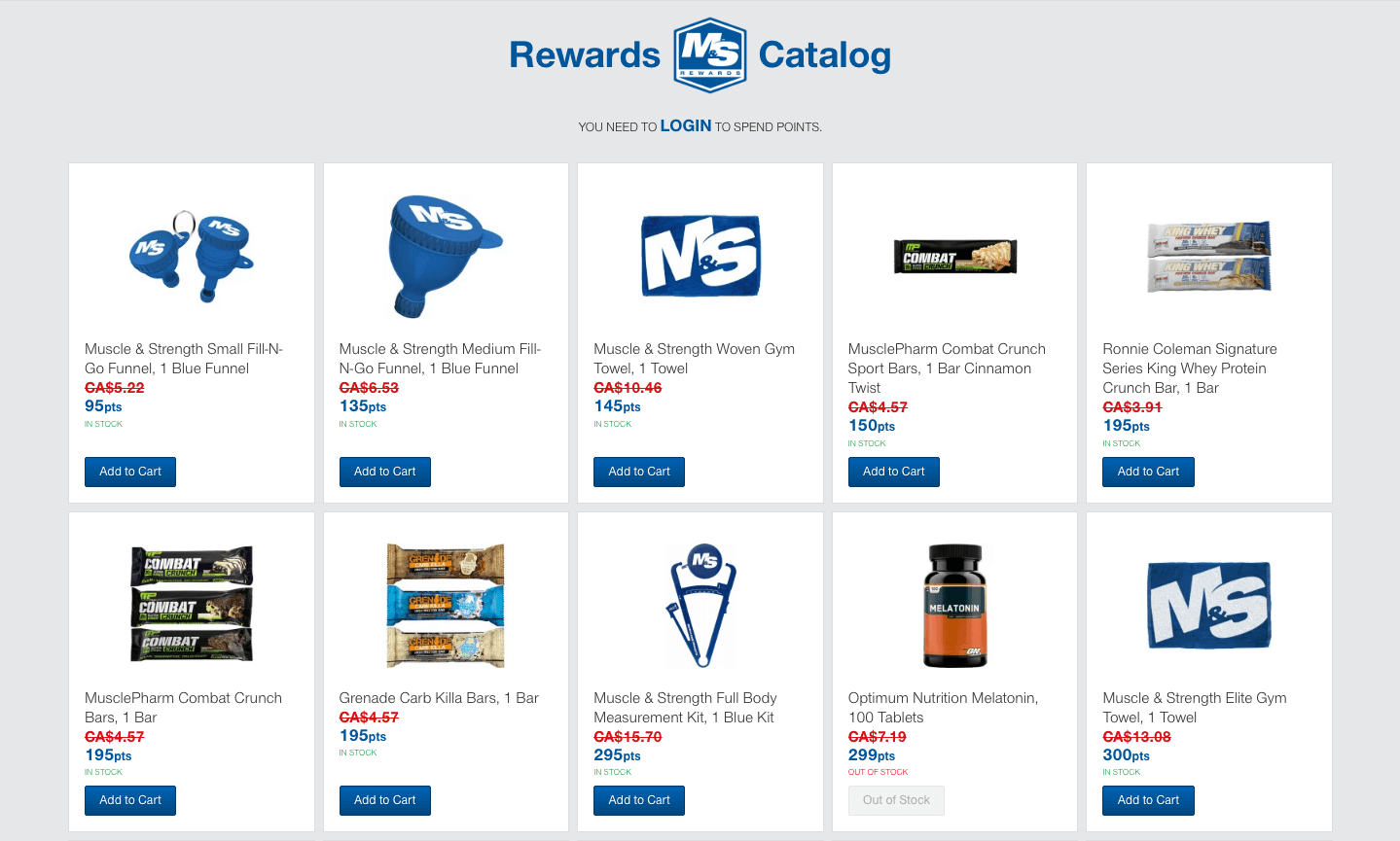
- Make it easy for customers to grasp the benefits. Some brands detailed rewards visually by using 'rewards catalogs'. Treat the rewards as you would any other product needing an enticing product page. See how to curate a good rewards catalog. [SIDE NOTE: Notice Klova's use of 'your rewards' to appeal as personally as possible to customers].


Here is an example of Sephora's rewards catalog.
/Beauty-Insider-Rewards-Offered-1.png)
Here is an example of Starbucks' rewards catalog. In this case, visitors need not click to arrive. The catalog is the second section they see after a summary of the rewards. The rewards are arranged in order of price in rewards points, named 'stars'. Visitors can see what they will get by clicking through 5 stars price tabs ranging widely from 25 to 400. Unlike Klavo that discusses how to earn before rewards, Starbucks discusses these elements in reverse.
 |
| Introduction section offers a summary of the program's types of reward. |
- For hybrid programs that, in addition to the basic 'earn & burn', include exclusive top tiers whose membership can proceed satisfactorily only with purchases, you may advertise these different components separately.
- Example: Klova has a subscription program that involves free shipping. However, it is not mentioned within the explainer page. Rather, the entire website has banners advertising this subscription. Their program appears to apply to only select items however.
STEP 3: CALL TO ACTION
- Provide a call to action that can be readily executed after each section of information. In other words, make the process as quick, convenient and easy as possible for customers.
- Use animation that complements rather than steals attention from the message. Less is more! Opt for subtler transitions and effects; like crossfade transitions. Avoid having many elements flying in and out of view on the screen. Avoid fancy loading pages that require visitors to wait. In fact, a safe and beautiful approach is to use only buttons with hovering animation for the entire page.
- Example: The only type of animation on Klova's introduction to the loyalty program was that their CTA buttons changed color slightly if visitors scrolled over them. Limit the use of distracting animations.
- Example: Only after the audience received all the necessary basic introductory information required to sign up does Klova place a moving animation; their rewards currency 'coins' stacking up next to the CTA button. They placed this animation only once on the entire page; immediately below the 'How to earn' and 'How to redeem' sections of Klova's explainer page.
- If you must use animations (other than hoover button animations), use only those that are quick-loading.
- CTA buttons should ideally contrast with the general color scheme of the page. For instance, if your brand color is green and the page has many green elements, select the color that is opposite green on the color wheel for the button.
- If you must, make email subscription pop-up dialog boxes appear to disrupt visitors only after their behavior on the site or page suggests a sufficiently keen interest or correlates with the desired action. Example: if customers have already scrolled past more than 1/2 or 3/4 of the long scroll page past the basic top level introductory information about the program. Example: if customers have scrolled far down a page with referral information by influential persons for the target market.
- Ensure the CTA will work on all possible devices that your market uses.
- Introduce your program in just as strategic a way as you should a new product or person.
- Apart from the explainer page, which is likely to be on its own webpage or brochure, your home page or other company material may require a well crafted introduction.
- Provide 'Terms & Conditions'. It may be necessary to provide a link to this information on a different page for the odd customer who will seek it out.
Terms and Conditions
- [Company Name] reserves the right to modify or cancel coupons at any time.
- [Company Name] reserves the right to change the value of rewards at any time.
- Rewards can be redeemed ONLY once.
- If you redeem a coupon for a purchase less than the full value of that coupon, the balance of the coupon is not redeemable on another purchase.
- If you return any of the items purchased with a coupon, the coupon discount or value may be subtracted from the return credit.
- Animations that are useful other than the CTA may include those that show customers progress in following the joining instructions. Progress bars or individual item progress indicators (like a tick that appears in green when the visitor has successfully completed an action or a red cross for otherwise) are ideal.
CONTENT RELATED TO LOYALTY PROGRAM EXPLAIN PAGES
- Ensure that your loyalty rewards program explainer page passes the grunt test.
- Why the old 'earn and burn' loyalty program model is failing and a new approach for modern consumers.
- Tiered loyalty programs
- Use spend-based loyalty rewards programs to give greater rewards to customers with the highest customer lifetime value (CLV) ... and reduce costs while you are at it.
- A great loyalty rewards program can not help your business if customers can not understand it sufficiently well to sign up. Create a loyalty rewards program explainer page.
- Measure the success of your loyalty rewards program.
- Analyze how well your rewards catalog has been curated


No comments:
Post a Comment
Note: Only a member of this blog may post a comment.