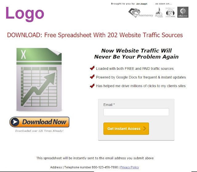
A landing page is the first page that a lead sees after clicking through an off-site advertisement (like Instagram story, email campaign, free or paid Youtube video, Facebook, Google, search engine results page / SERP and so on. This post will guide you through the steps of planning an effective landing page.
 |
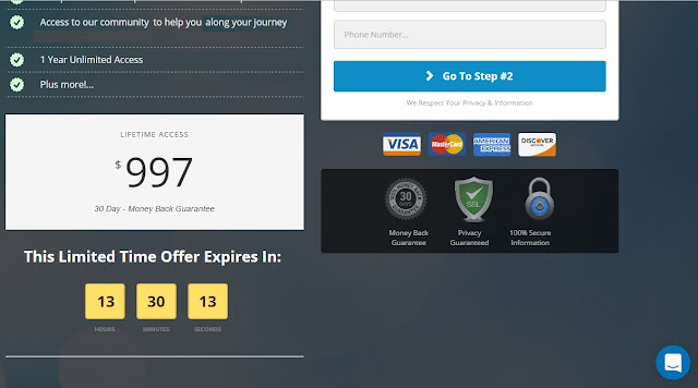
| This great landing page not only looks attractive but also has many key elements that include a list of product benefits (top left); a key benefit or unique value proposition next to the price, 'lifetime access', as if justifying it; urgency; high contrast in the urgency element as black on yellow stands out; contact form with clear call to action / CTA 'Go to Step 2' button; security badges; payment methods and live chat window (bottom right) |
USES
Its goal is to focus the lead's attention on only one thing; a single call to action (CTA) as follows.
- CTA 1: 'lead generation' form, aka 'opt-in', 'squeeze page', 'splash page' or 'lead capture page' form, ie a contact form that converts visitors into leads by collecting contact information. This is best done when coupled with the promise of 'lead magnet', aka a 'bribe', ie a non-cash payment using something of perceived value like
- a gift card
- a discount coupon
- a chance to win something of perceived value
- free consultation
--
--
- CTA 2: 'click throughs', ie a sequence of pages (and or emails) through which visitors move according to their individual stage in the sales funnel. The sequence often occurs through email autoresponders. Either way, each page or email in the sequence sells the idea of a value proposition and product. Each page's CTA is to either go to the next content page or more directly to a product page or shopping cart.
DOs
- Prepare to get visitors to understand your message fully within 5 seconds or less
- Place the CTA above the fold (ie high on the page before visitors must scroll down)
- Use color contrasts. The CTA button should contrast with the background and other page elements. Colors on opposite sides of a color wheel stand out the most. See an effective example below with a yellow button and blue background. (The white text does not take away from those more prominent elements)
- Have only highly targeted content. Every element of content should be congruent with the message that motivated visitors to click through to the landing page. This is particularly true for click through pages. Use videos and images that reinforce the message, especially because they also speak to non-readers
- Deliver value. Your target market should perceive your offer as having value
- Clearly show visitors the value proposition.
- For lead generation, offers should be directly related to your main product to raise the chance that your leads can be converted
- Limit distractions from the CTA and offer.
- Limit navigation away from the CTA
 |
| This is a lead generation landing page by the 'Welcome Screen' app. This kind of landing page is ideal from Youtube videos or other external links that provided some value on weight loss and restoring health. If value (perhaps in the form of a very informative how-to video) has already delivered some value, it is a 'reverse squeeze' / landing page because some part of the value has already been delivered. It covers an entire webpage. It therefore hides all of the website's usual navigation elements. However, it is interesting that it does not hide the Privy app (in the top right corner) or the Zopim Chat app (in the bottom right corner) that are also used on this Shopify store. This type of landing page is ideal for special promotions. It works in conjunction with otherwise competing apps that may be used for general newsletter signups. |
- Limit exit points. This includes limiting the amount of navigation away from the page.
- Keep lead generation forms as short as possible
- The fewer fields you request, the better. Most marketers collect only the email address at first and then get remaining fields later. However, a second exception to this is the lead's 'first name'
- Avoid asking for address, telephone number (as these generally turn people off)
- Keep content short
- use bullet points to highlight each benefit
- material should be quick and easy to scan. For instance, short headings can have bold print with bullet point information
- Test different pages and elements
- Research suggests that basic 'Submit' or 'Contact Us' buttons are relatively ineffective options, especially as they attract spammers. Buttons that speak specifically about the offer are better like 'Sign up', 'download now', 'I want x now' and so on.
- Prepare an effective 'Thank you' page for after visitors complete the CTA
- Include social media icons
- Give leads something to do that moves them down the sales funnel
- Assure leads of their privacy.
- Provide a link to your privacy policy. However, remember to keep visitors on the landing page. So set the link to open in a new window or better yet, to open as a popup window. To hopefully satisfy their concerns to the extent they will not engage the link at all, I set a tiny text window to appear when the mouse hovers close to or over the text of the link. The text says, 'We will not share your contact details without your consent.'
- Your details will not be shared with third parties
- Prompt leads to enter their MAIN email address to avoid missing time-sensitive information.
- Whenever suitable, include images of smiling people as they increase conversion significantly
- Prepare a confirmation page
- to instruct the lead to the next steps like
- white listing your email address
- checking email for instructions on how to get the lead magnet
- to create expectations like the frequency of promised content
- to invite friends, possibly for something in return
 | |
|
- Avoid using the 'Home Page' as a landing page. Unless its message responds specifically to the goal of your marketing campaign (which is generally not the case), create a highly targeted landing page.
- Apps that allow you to create landing pages. These include
- MailChimp's 'general' signup form opens on a dedicated webpage, without navigation or other distractions. MailChimp has a free version for accounts with up to a certain number of mailing list subscribers (I believe 2,000). This option is quite attractive because adding new subscribers is full automated (unlike with some other options). Paste the automatically generated URL (as pictured immediately below) into HTML code. The resulting page will have a URL that incorporates your domain name in the earlier portion.
-
- Privvy
- 'Welcome Screen'. It also has a free package
RELATED CONTENT
- Finished the landing page? Engage your leads.
- Motivate visitors to go to your landing page with a promotional video
- When you have completed your landing page, consider planning your sales pipelines.


No comments:
Post a Comment
Note: Only a member of this blog may post a comment.